Most websites ask visitors to read, compare and decide in a matter of seconds. A video background gives that first screen a sense of depth before a single word is processed. It can suggest technology, calm, energy or craft without a headline having to explain it.

But the line between atmosphere and noise is thin. A loop that fights the typography, drains a phone battery or takes four seconds to appear does more harm than a plain colour. Good background video behaves like lighting in a room: you notice the mood, not the fixture.
Why motion changes the first impression
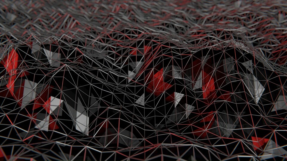
Static pages rely on composition. Motion adds time, and time creates expectations. A slow drift tells visitors to settle in; a fast flicker tells them something is happening now. That is why abstract particle waves, low-poly landscapes and soft light streaks work so well behind interface copy: they imply quality and movement without telling a specific story that might contradict the brand.
Motion also helps a page feel current. Video is no longer a novelty reserved for film sites. SaaS products, design studios, hotels and financial platforms all use it to signal that they care about detail. The key is restraint. One well-chosen loop is stronger than five competing animations.
A background should make the content easier to feel, not harder to read.
Where a video background earns its place
The hero is the obvious spot, but not the only one. Consider a quiet loop behind a product statement, a full-width divider between sections, or a dark abstract panel behind a call to action. Product pages can use a short clip to show texture or scale; event pages can use motion to set the tone before the schedule begins.
Editorial layouts benefit too. A low-poly landscape or a slow crystal formation can separate long sections without adding another stock photograph. The clip becomes a visual pause, giving the eye somewhere to rest between arguments.
- Keep the loop short and seamless; a visible jump pulls attention away from the copy.
- Use a poster frame that looks good on its own, especially on slow connections.
- Test with the real headline and buttons, not placeholder text.
- Respect reduced-motion settings and provide a still alternative.
- Serve a smaller file to phones and lazy-load clips below the fold.
The technical checklist that protects the design
Start with the poster image. It should look good on its own, because that is what many visitors will see while the video loads or if data saving is enabled. Keep the loop between six and fifteen seconds, remove audio entirely, and set the video to play inline, muted and on loop.
Contrast is non-negotiable. Add a subtle overlay or choose footage with a calm area where the headline sits. Test at mobile widths, where a desktop crop can turn a beautiful wave into a bright smear behind the menu. And always respect the reduced-motion preference: a still frame is a valid version of the same design.
Finally, measure the cost. A five-second, well-compressed loop can be lighter than a hero carousel full of large photographs. Serve a smaller file on phones, lazy-load below-the-fold clips and avoid autoplaying several videos at once.
Choosing footage that supports the brand
Ask what the page should feel like before asking what it should show. A cybersecurity company may need calm, precise motion; a creative studio can afford something stranger. The clip does not have to illustrate the product literally. A blue particle wave will not explain a software feature, but it can make the feature feel fast and well made.

Look for slow, continuous movement, a clear focal area and colours that already exist in the palette. If the footage needs a filter, a gradient overlay and three attempts to fit, it is probably the wrong clip.
Used with discipline, video turns a website from a document into an environment. Used without it, the same clip becomes a loading screen with a marketing budget.