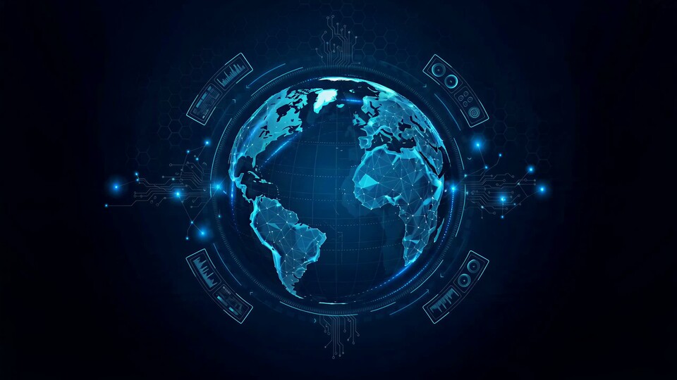
A quantum experiment, a neural pathway or a network of data has no natural camera angle. Scientists build models, diagrams and simulations. Video can take those materials and turn them into something a broader audience can follow.

The abstract quantum network — golden and cyan waves, branching paths, glowing particles — is not a literal illustration of a specific experiment. It is a visual language for complexity. Used honestly, it can prepare the viewer for the idea before the detailed explainer arrives.
Translate, do not decorate
The first question is always: what is the one idea the viewer should leave with? Then choose the visual that supports that idea. A metaphor can be powerful, but it has to be labelled as a metaphor when accuracy matters. Avoid implying that a stylised animation is a direct observation.
Work with the researcher from the beginning. They can tell you which simplification is acceptable and which one changes the science. The best science communication is a collaboration, not a marketing overlay.
Formats for different publics
A grant application needs clarity and credibility. A conference talk needs a visual that works on a large screen and supports a live speaker. A press release needs a short, shareable clip. A museum exhibit needs atmosphere and a longer dwell time. Build the core explanation first, then adapt it.
- A 15-second social explainer built around one idea.
- A two-minute research story for the website and press page.
- A silent conference loop for a poster session or booth.
- Stills and diagrams for the press kit.
- An atmospheric version for an exhibition or public event.
Make uncertainty visible
Science is not a series of certainties. Video can show probability, scale and open questions instead of pretending that every result is final. A calm visual language helps: steady movement, clear labels and room for nuance.
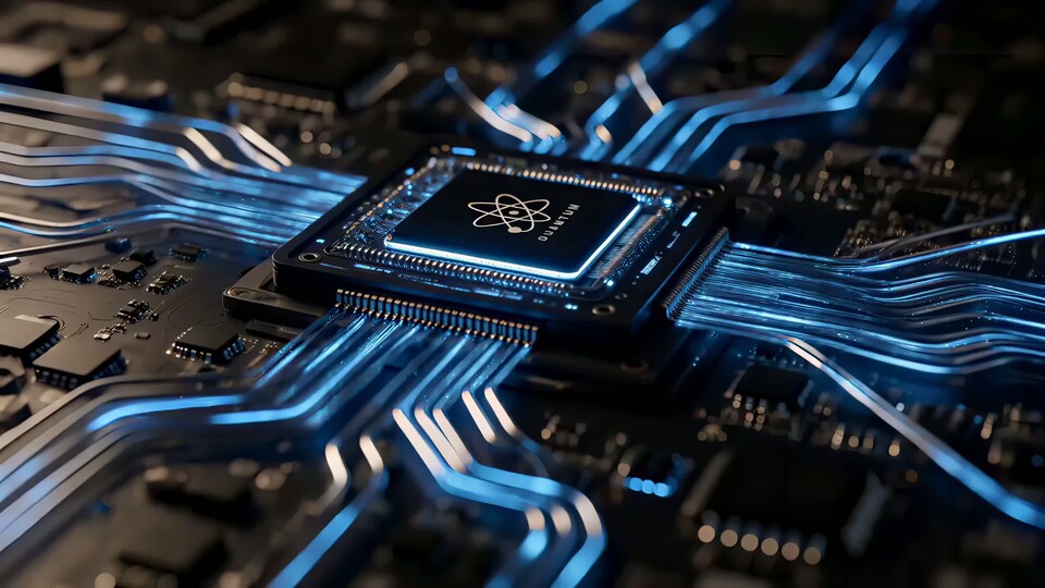
For deep tech and engineering, the physical object matters. A chip, a sensor or a prototype gives the abstract idea a body. Pair it with the simulation so the viewer can connect the model to the real world.
The value of a good visual language
Research institutions compete for attention, funding and talent. A coherent visual system makes their work recognisable across papers, talks, websites and social channels. It also makes complex ideas easier to teach.

The goal is not to make science look simple. It is to make it look approachable enough to stay with.